Create a user friendly way
to sell pensions online
AXA Insurance wanted to promote the sales of pensions online, but had 2 challenges:
1) is you need to have a general understanding of TAK21 en TAK23 to be able to buy this product 2) You cannot buy products from AXA but have to buy from a broker.
Role
Freelance UX consultant in the CX team at AXA Insurance in 2018.
Working in a team of 4 on the flow of selling pensions online.
Duration
3 month contract with extension of a month in 2018
Location
full time in Brussels AXA Insurance HQ (Trône)
Task
Find a solution to educate people while selling TAK21 and TAK23 pension products online. And end the flow by making an online payment and choosing a broker. Make the salesflow short, easy to use, and let it pass MIFID and Legal regulations.
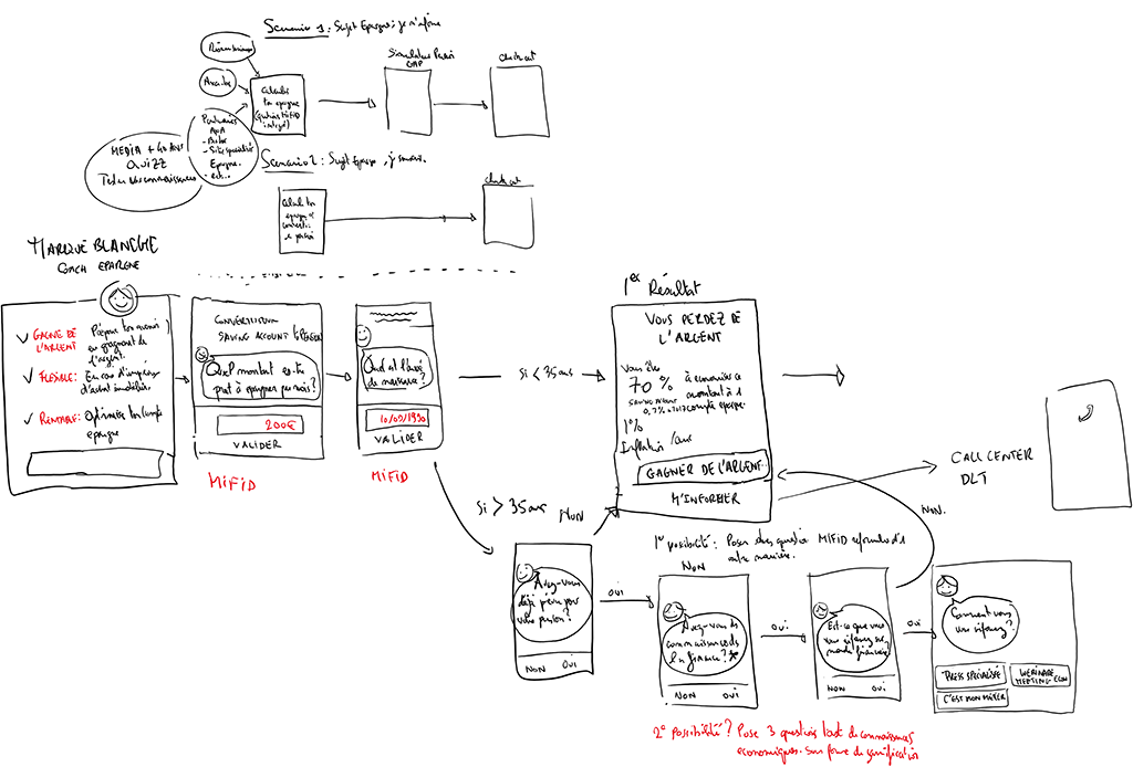
Be a part of the design thinking team, sketching out the salesflow on whiteboard in French. Drawing the flow in Figma in the afternoons, all in French. And translate the flow to Dutch for user testing in 2 languages. And present & defend the work in design sprints to stakeholders. Set up user testing flows in Invision. Do the interviews, test length of the flow, ease of use, understanding of the products. Create an online checkout.
The challenge
• draw a salesflow that would educate about pensions & sell online
• collaborate with stakeholders (business, marketing and product owners) in bi-weekly sprints
• understanding complex pension products
• understanding differences between bank & insurance products
• understanding MIFID regulations
• work in a French & Francophone team
• minimizing heavy legal disclaimers in team
• moving fast in short (iterative) loops
• signing off for MVP end of year
Tools & Methods
• use design thinking methods & co-creation to create salesflow
• whiteboard sketching
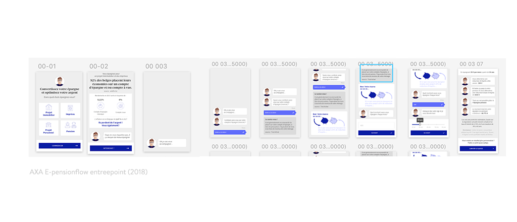
• designing the flows in Figma in FR & translating them in NL
• Invision: user tests of understanding concept flows & finalized design flow
• implement iterations to finalize the MVP before the due date
• make presentations to explain insights
By MIFID regulations you can only sell TAK21 and TAK23 pensions to people who know the difference. Therefor we decided on quizzing people on their knowlegde, during the salesflow. We used the existing component library but also designed new ones like the chatbot in a cohesive style. (Including AXA mascotte).
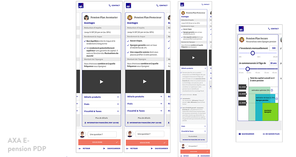
After the quiz, the salesflow would lead you to a productfiche of both pensions and explain the benefits. (But it is illegal by law to advise a preferred product).
You could browse, simulate your savings and decide within the same session to buy or skip the quiz for next time if you could prove you did the quiz.
We used innovative solutions at AXA at the time:
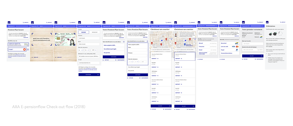
• For the check-out flow in our proposal, an OCR Scanner functionality
• Itsme integration for the identity card recognition
• Google maps, to localise and suggest the nearest AXA broker or office
• several payment offers to finalize the order (pay or the order did not go through)
Other projects
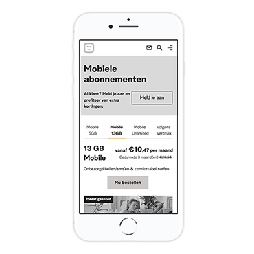
Telenet Mobile stand alone pagesService design - UX design
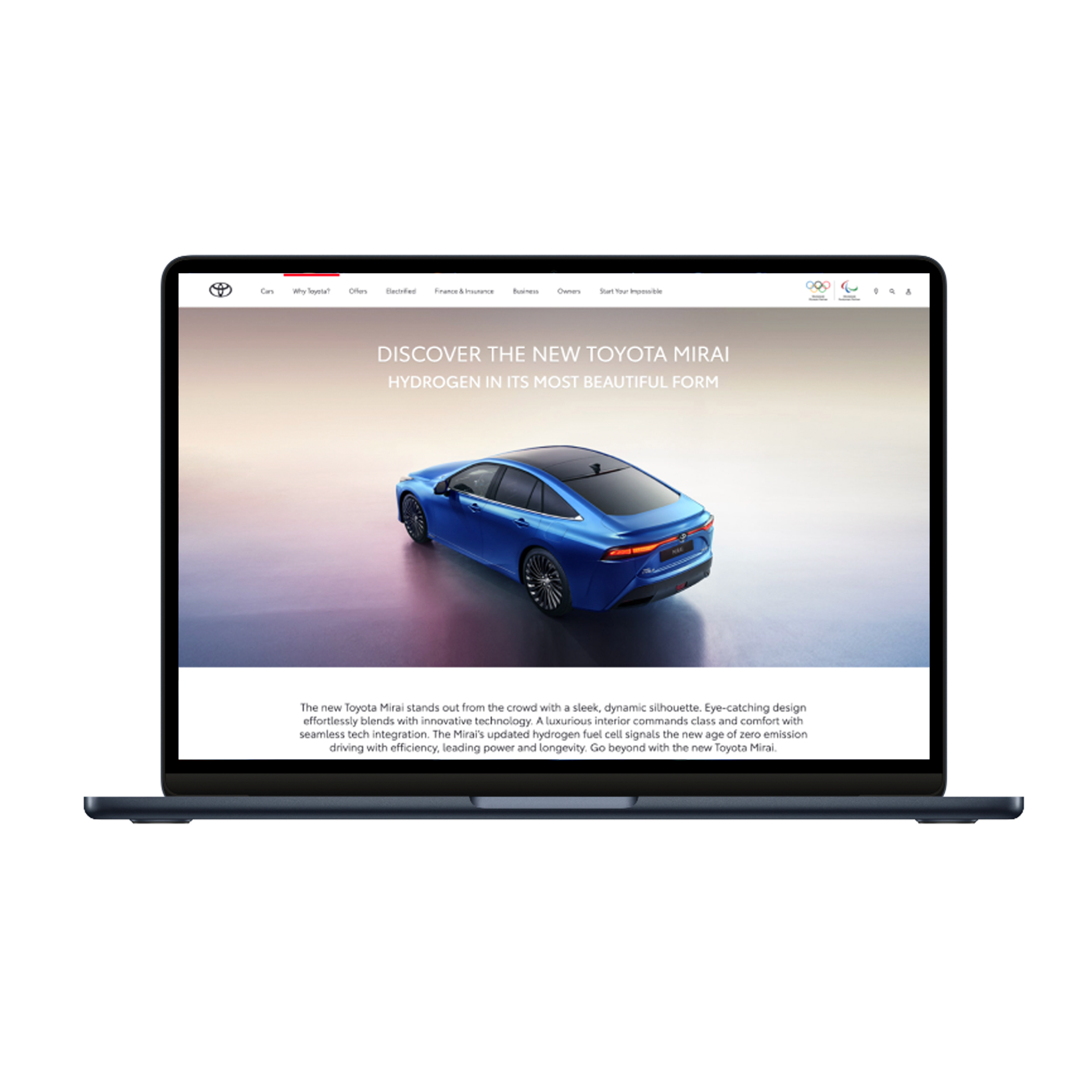
Toyota Motor EuropeUX - content design (2021-22)
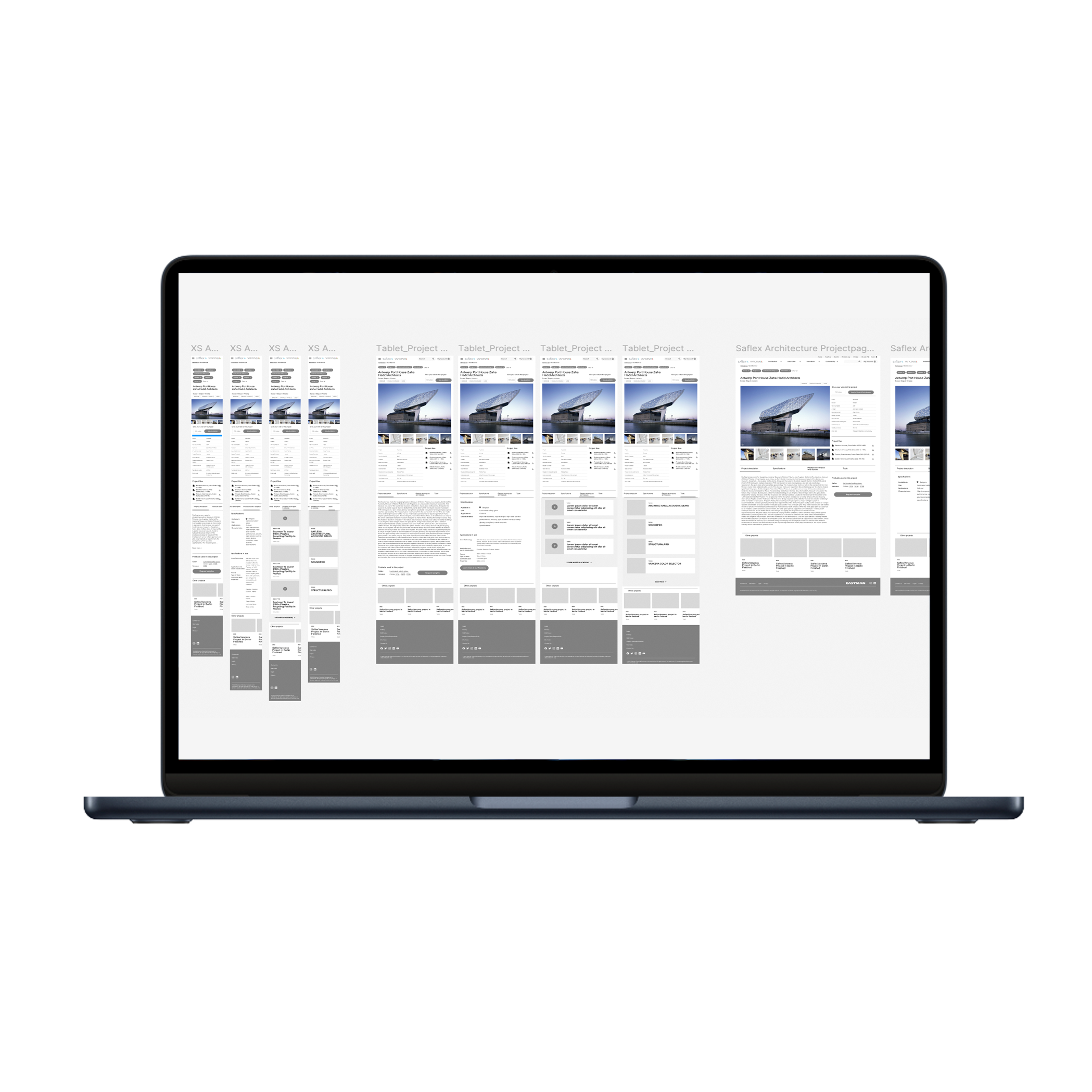
Eastman - SaflexVanceva websiteUX/UI design (2022-23)
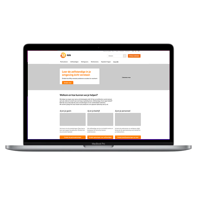
NN - from workshop to user journeyUX Strategy & UX design (2023)

VAB - make our website more user friendlyUX design (2021-22)
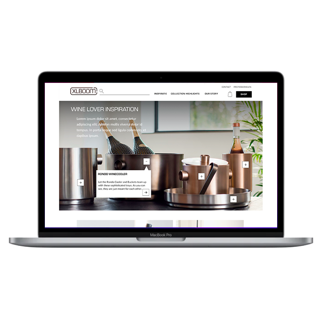
XLBoom webshop redesignUI design (2021)
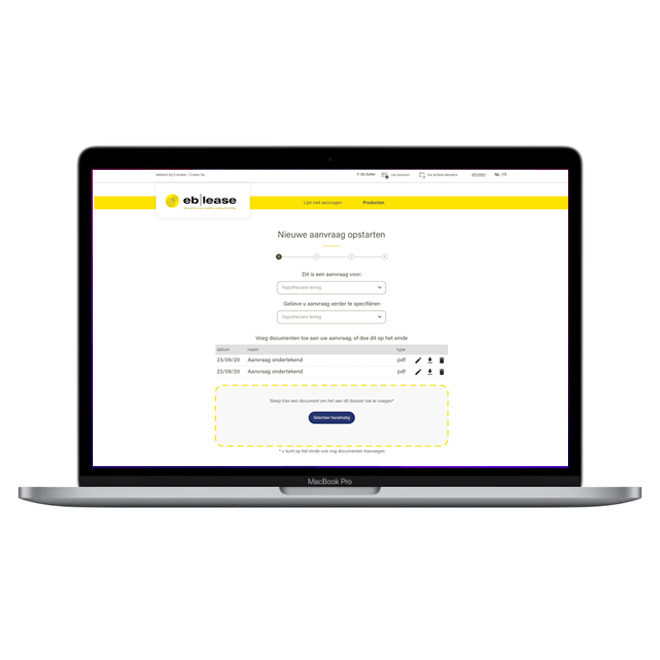
EB Lease E-broker platformUX design (2021)
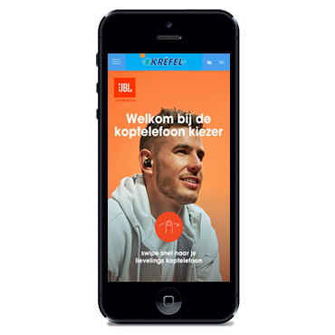
Choose JBL headphonesUX/UI design (2020)
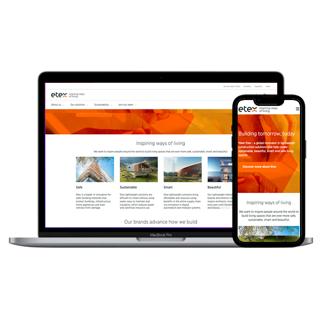
Redesign our website (Etex Group)UX/UI design, Content strategy (2020)
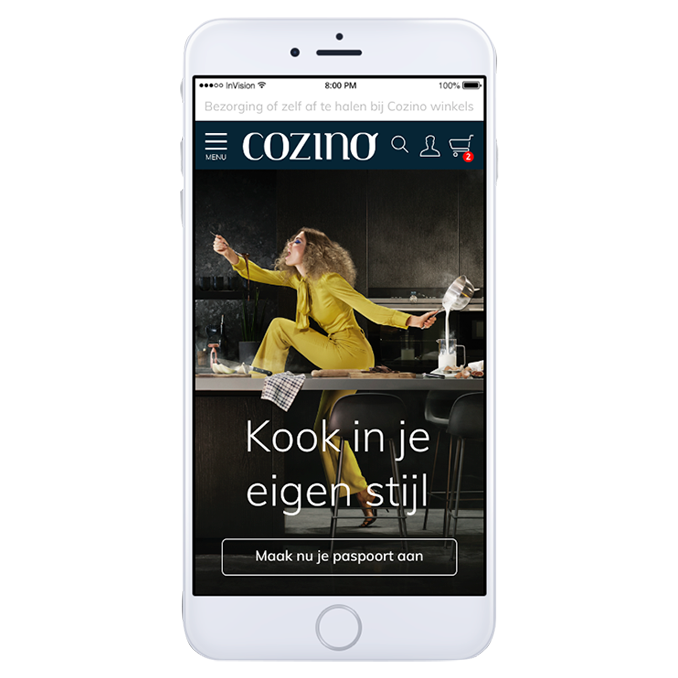
Create a Cozino brand & websiteUX/UI design (2021)
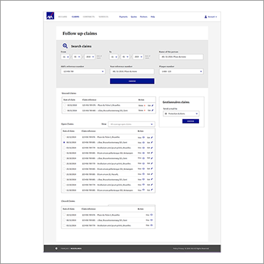
Do research & find our users (AXA Claims tool)User Research & UX design (2019)
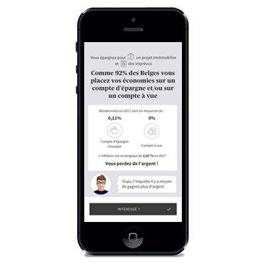
AXA E-pensionsUX design (2018)
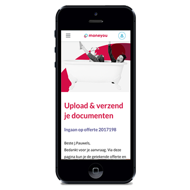
Moneyou component libraryUX design (2017)
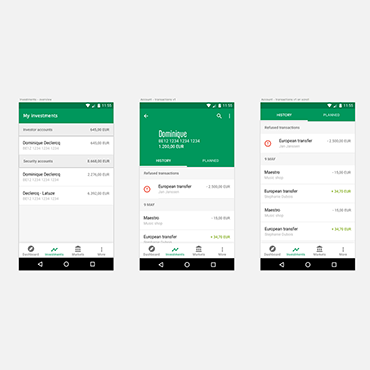
Investment app for BNPPFUX Design (2016)
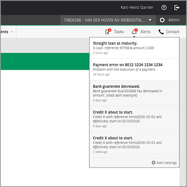
Notifications for BNPPFUX Concept design (2016)
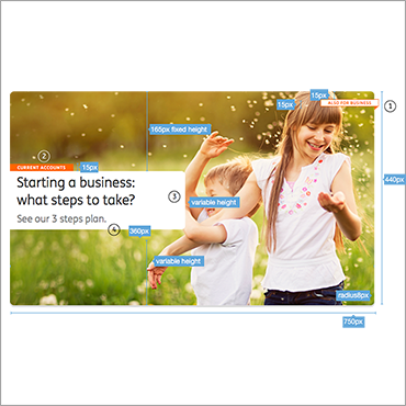
ING Retail bankingUX Design (2015)
Location
Mussenstraat 48,
9070 Heusden (B)
Email
hello@iamsmitten.be
Mobile
+32 (0)474 490016
BTW
BE0891.199.376
