VAB more mobile friendly
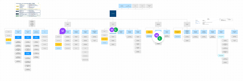
From workshop to site structure: navigatie-verzekeringen-rijschool-b2b
Challenge
VAB wanted to make the user experience of the website more user & mobile friendly and simultaneously update the back-end to a newer Drupal version. It is a complicated website, they have so many services, each tab is a different business unit. Almost could be a different website; Insurance, driving school, second hand cars, tire services, shop for vignettes, etc. We looked at the navigation, structure of the pages, online buying funnel and in strategy they looked at the naming of the products, a.o. We started with the insurance section.
Role
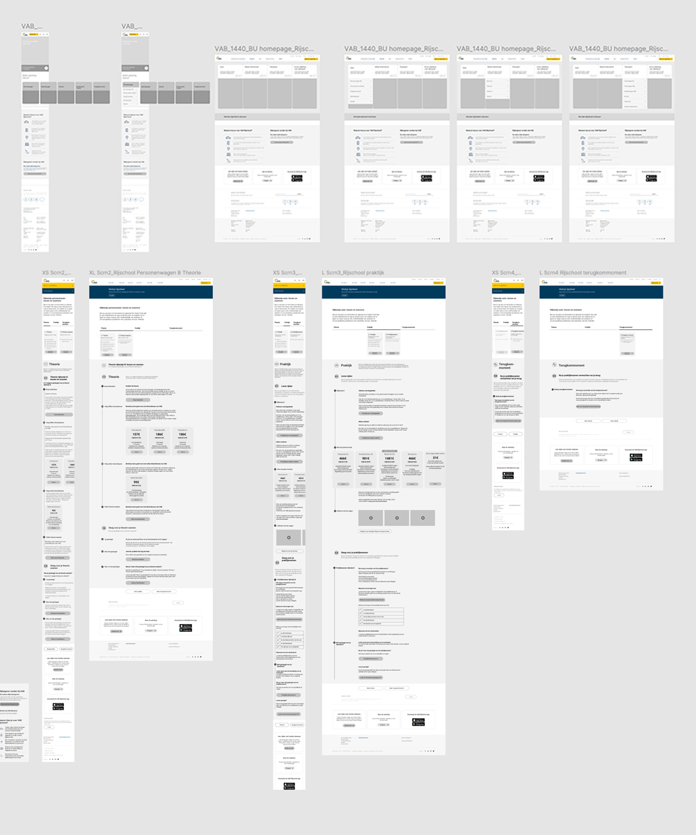
We worked in an autonomous team, (UX / UI and project manager) with feedback loops to the CX director. My role as UX designer / Information Architect was to structure the navigation, salesfunnel and page layout of the different sections of the website (such as insurances and driving lessons school). We worked in team simultaneously on different sections, feedbacked each other in the solutions we found and presented to the client.
We worked in weekly design sprints, where we presented to the group of stakeholders where we each took on our specialty role. There was a lot of give & take and compromises to make.
Task
• Discovery workshop w/ CX director and stakeholders to validate direction
• find the balance between business and UX solutions
• structure navigation, finding the solution between needs & best practices
• draw mobile friendly, high fidelity UX designs including detailed content
• present & defend UX designs to the client team of stakeholders
• keep UI designer in the loop during the process
• involve CX and/or Strategy directors if necessary
Location
Antwerp offices of WundermanThompson (now VML)
Timing
2021-22
Tools & Methods
• Miro for workshops and conceptual mockups
• Figma designs & clickable mockups w/ animations (more in UI)
• Give structured presentations w/ project manager & UI designer
A complex platform with a lot of different types of business; from insurance to driving classes, and from webshop with vignets to vacation tips catalogue, and tire centre (much like ANWB in The Netherlands).
(Disclaimer: Unfortunately we were not able to make restructuring changes to all the different tabs as they were internal business silos. And sometimes not even change the structure of the pages due to development implications. We had clear instructions but gave our CX / UX-UI expert advise, how to approach nonetheless).

Other projects
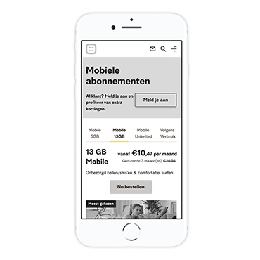
Telenet Mobile stand alone pagesService design - UX design
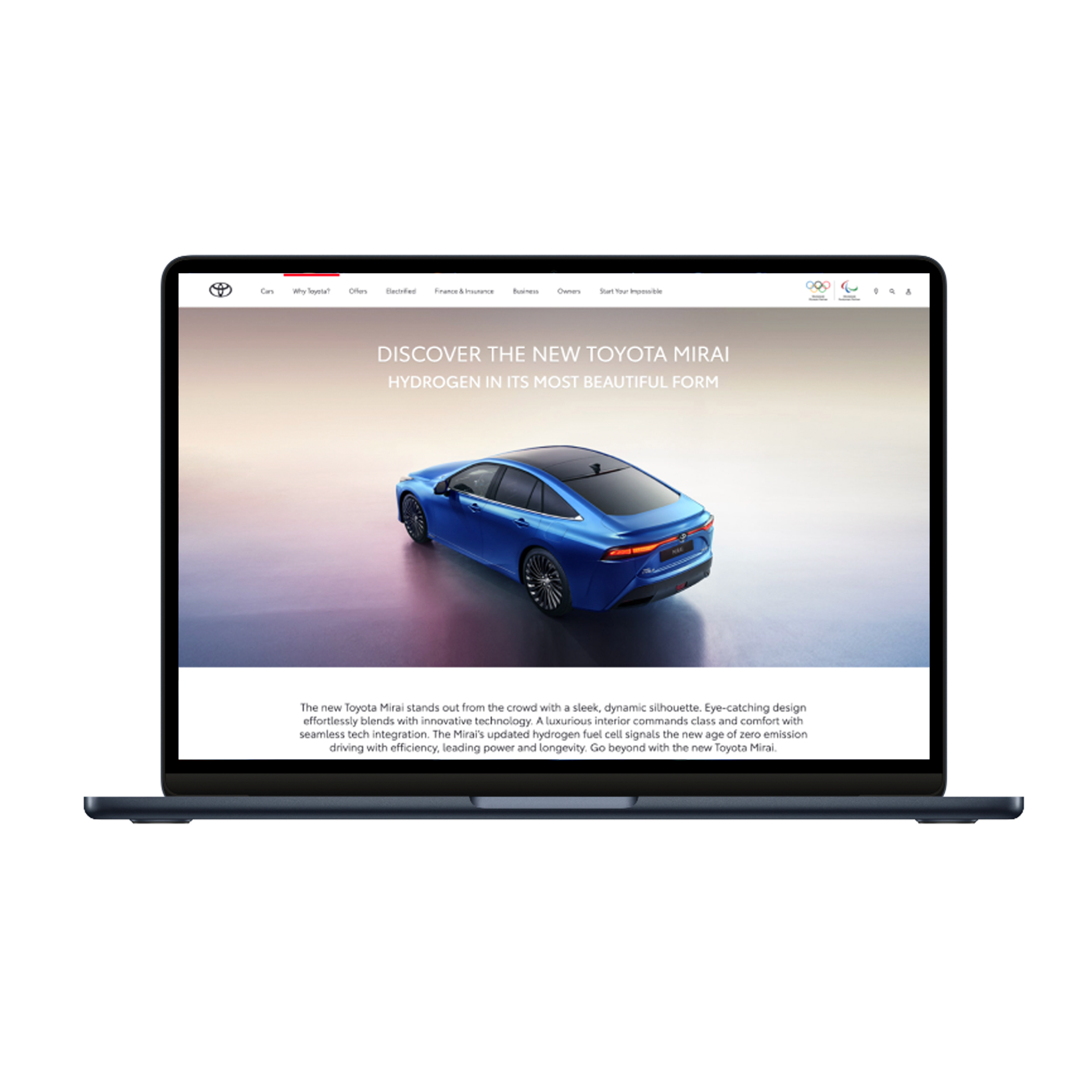
Toyota Motor EuropeUX - content design (2021-22)
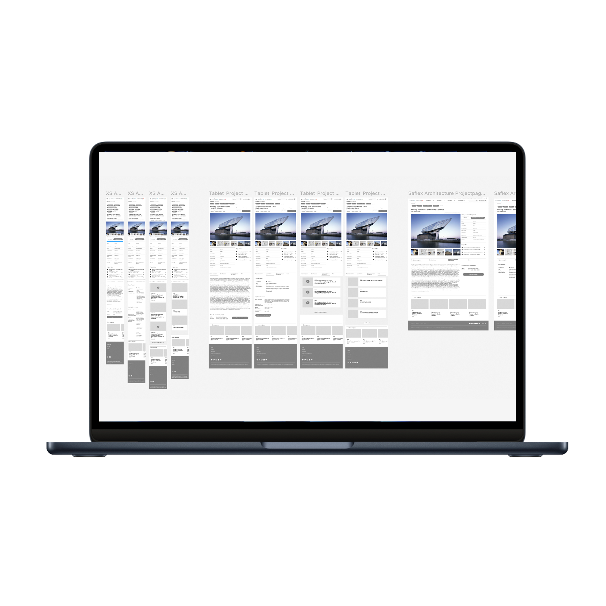
Eastman - SaflexVanceva websiteUX/UI design (2022-23)
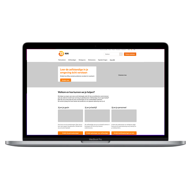
NN - from workshop to user journeyUX Strategy & UX design (2023)

VAB - make our website more user friendlyUX design (2021-22)
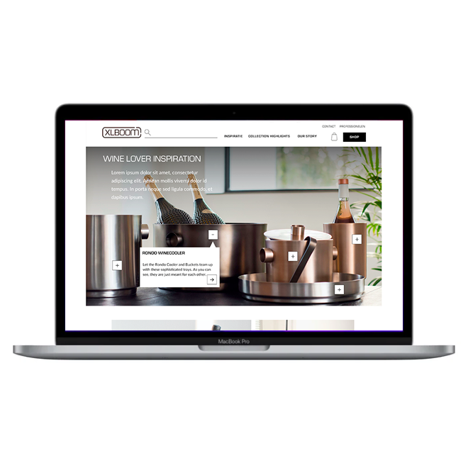
XLBoom webshop redesignUI design (2021)
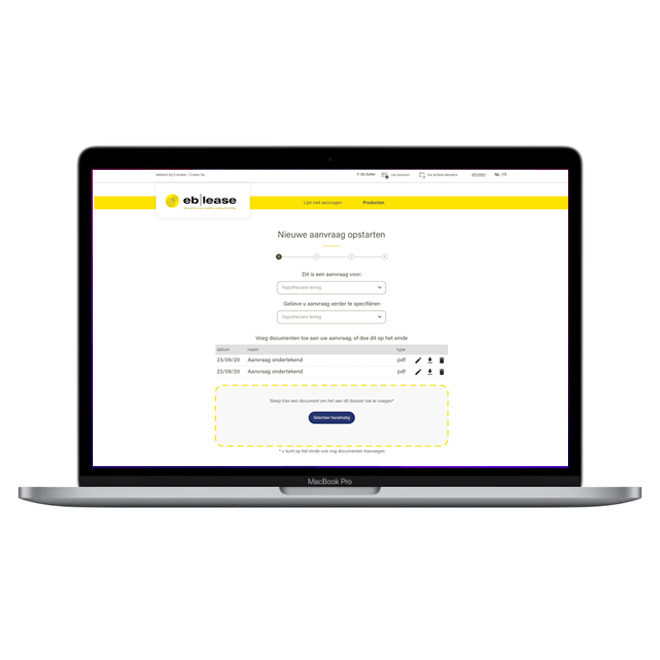
EB Lease E-broker platformUX design (2021)
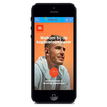
Choose JBL headphonesUX/UI design (2020)
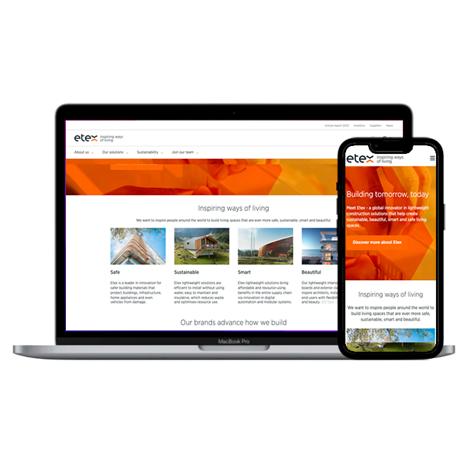
Redesign our website (Etex Group)UX/UI design, Content strategy (2020)
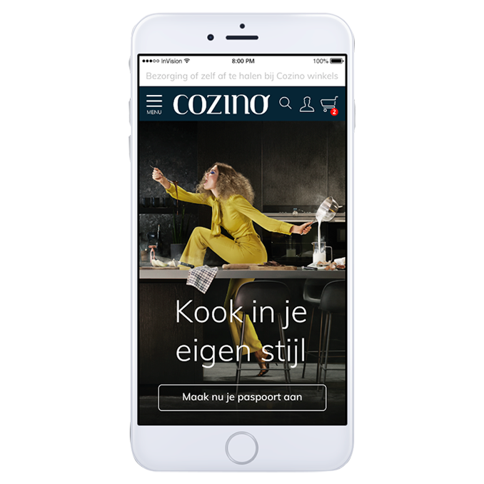
Create a Cozino brand & websiteUX/UI design (2021)
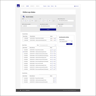
Do research & find our users (AXA Claims tool)User Research & UX design (2019)
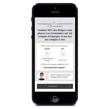
AXA E-pensionsUX design (2018)
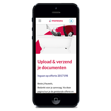
Moneyou component libraryUX design (2017)
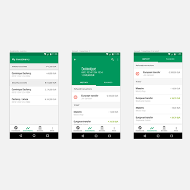
Investment app for BNPPFUX Design (2016)
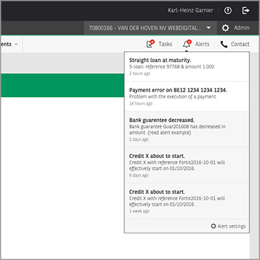
Notifications for BNPPFUX Concept design (2016)
ING Retail bankingUX Design (2015)
Location
Mussenstraat 48,
9070 Heusden (B)
Email
hello@iamsmitten.be
Mobile
+32 (0)474 490016
BTW
BE0891.199.376
